

News•Viewtracker - Analytics for Confluence
New Viewtracker features for Cloud and Data Center
Import views with Viewtracker to analyze Confluence usage pre-installation for valuable insights and metrics.
Feb 28, 2024Our app team has been very busy in the last months, and we are proud to present our new powerful Confluence macro to you! In this blog post, we explain what this new macro can do.
This new macro lets you bring your Confluence usage data to life. You can create custom reports on Confluence pages and make the data analytics visible — even to users without Viewtracker access! You can select as many metrics as you want and display nice-looking analytics insights on your Confluence pages. The new macro is available for Cloud and Data Center and replaces the Cloud macro “popular content,” offering more possibilities to display your Confluence data.
To use this macro as a Viewtracker Cloud or Data Center customer, you need to type “/Analytics Report” on Cloud or “{Analytics Report” on Data Center on any Confluence page to open the macro. This will open the macro interface, and you can display your data in Chart, Tiles, or Text form. You can then choose if you are interested in Page or Space analytics, what metrics (most viewed pieces of content in a space, views over time, most active users, … ) you want to display and select the time period. You can place multiple macros on the same Confluence page. Learn more about how to use the macro in our documentation for Data Center and Cloud.
Here’s what you can do with each presentation type offered by the macro:
1. Charts:
Charts are the champions of visualizing trends and growth. Imagine a line chart tracing user engagement over weeks or a bar chart comparing content performance across different spaces. Charts excel at revealing patterns and fluctuations in your data, making them ideal for:
2. Tiles:
Eye-catching squares, each with essential metrics or “top 5” lists. This format condenses information into easily digestible chunks, perfect for:
3. Text or Lists:
For those who prefer a detailed, no-frills approach, text or list presentations offer a clear and concise way to showcase your Viewtracker metrics. This format is well-suited for:

To give you a clearer idea of how these options can add value to your Confluence pages, here are some hypothetical scenarios:
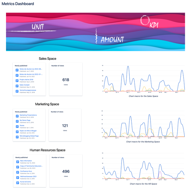
Space Overview Dashboard
Your space admin wants to implement an overview page that displays newly created content, the most viewed pages and blog posts, and the most active users.

This example demonstrates a data-driven approach to Confluence page organization. Metrics include newly published pages, last modified pages, top viewers, top contributors, and most viewed content, providing a comprehensive snapshot of user activity.
Create your Data Hub
You can create a “Data Hub” for your technical writers, blog writers or HR. Use the macros on a Confluence page to give them a quick overview of how their content is performing without accessing Viewtracker.
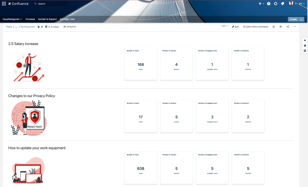
This is an example of creating a data hub for your content. The metrics used in this example are the number of views, viewers, engaged users and watches.
Share insights with your stakeholders
With the “Analytics Report” macro, you can share data insights with stakeholders without access to Viewtracker. Here is an example of how to provide them with an up-to-date performance report.
Our new Analytics Report Macro lets you display all kinds of data. From the most viewed pieces of content in a space to views over time or most active users.
Visitors of Confluence pages where macros were inserted will only see the items listed in the content lists if they have permission to view them. The same goes for user lists; those lists are only visible according to the Viewtracker data privacy setting.
The “Analytics Report” Macro offers a robust solution for displaying a wide range of data, from the most viewed content within a space to detailed views over time or metrics on the most active users. It’s designed to make data interaction customizable and user-friendly, ensuring that all team members have the tools to drive decision-making and performance improvement.
If you have questions or feedback, please contact our support team! We’re happy to receive additional feedback, which will help us improve our offering and provide the best product possible.

